blending two images: A Guide to Stunning Results

Aarav Mehta • October 23, 2025
Master blending two images to create stunning composites. Learn photo selection, tools, and pro techniques for seamless results.
Blending two images together is way more than just a technical exercise; it's about mashing up different realities to tell a completely new story. This technique, which pros call compositing, is your ticket to creating anything from subtle photo enhancements to mind-bending surreal art. And thankfully, the tools available today make it easier than ever to get started.
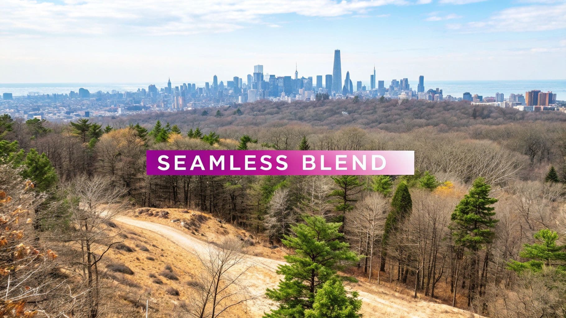
The Art of Seamless Image Blending
Pulling off a convincing composite image is a world away from a simple cut-and-paste job. You really need an artist's eye to make sure the final piece feels intentional and, well, real. The whole point is to merge two separate images so flawlessly that anyone looking at it just accepts the new scene without a second thought. This means getting all those little details right—the stuff our brains pick up on subconsciously to decide if something looks "correct."
This has been a craft that photographers and artists have been perfecting for decades. But the game really changed with digital photo editing in the 80s and 90s. Today, it’s estimated that a staggering 90% of all images get some kind of edit. If you're curious, you can discover more insights about the history of photo retouching and see just how far we've come.
Core Principles for a Believable Blend
If you want a result that looks professional, there are a few artistic rules you just can't ignore. Skimp on these, and your image will immediately scream "fake."
- Consistent Lighting: This is a big one. The direction, softness, and even the color of the light have to match across every element you're combining. You can't have an object lit by harsh afternoon sun from the right and drop it into a scene with soft, diffused light coming from the left. It just won't work.
- Matching Perspectives: The camera angle and lens distortion need to line up perfectly. You can't place an object shot from a low angle into a scene that was photographed from a bird's-eye view and expect it to look right.
- Harmonious Color and Tone: The color palettes, saturation levels, and contrast of both images have to feel like they belong together. This usually involves some careful color grading to unify everything and make it all look like it was shot in the same environment at the same time.
The best image blends are the ones you don't even notice. Success is when all the technical work becomes invisible, letting the new story or emotion of the image take center stage.
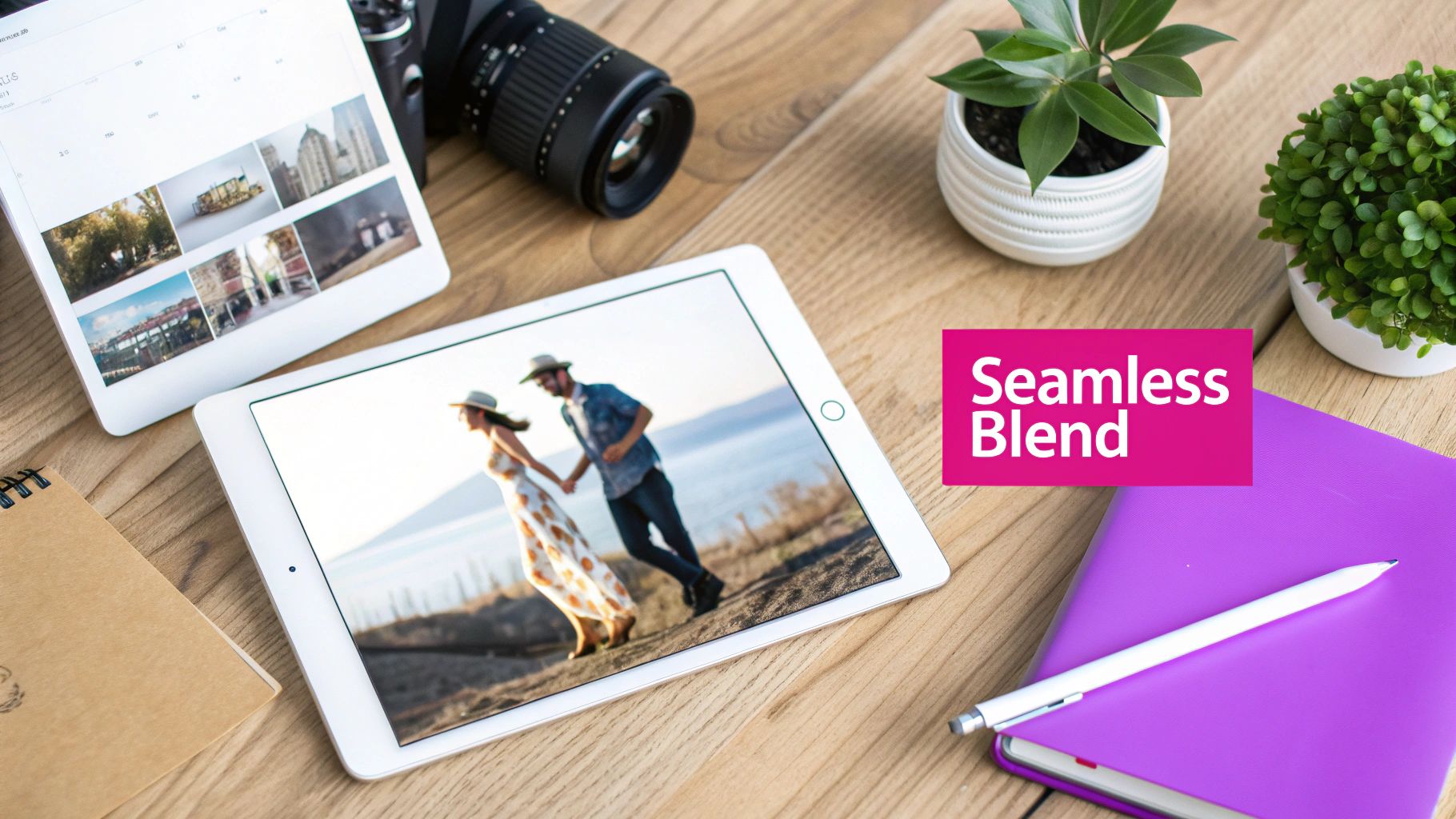
Choosing the Right Photos for Your Blend
A great image blend doesn't start in the editor. It starts with the images you choose. I've seen countless projects fall apart because the source photos were a bad match from the beginning, and no amount of editing magic could save them. Think of this as your prep work—get it right, and the blend itself will be a thousand times easier.
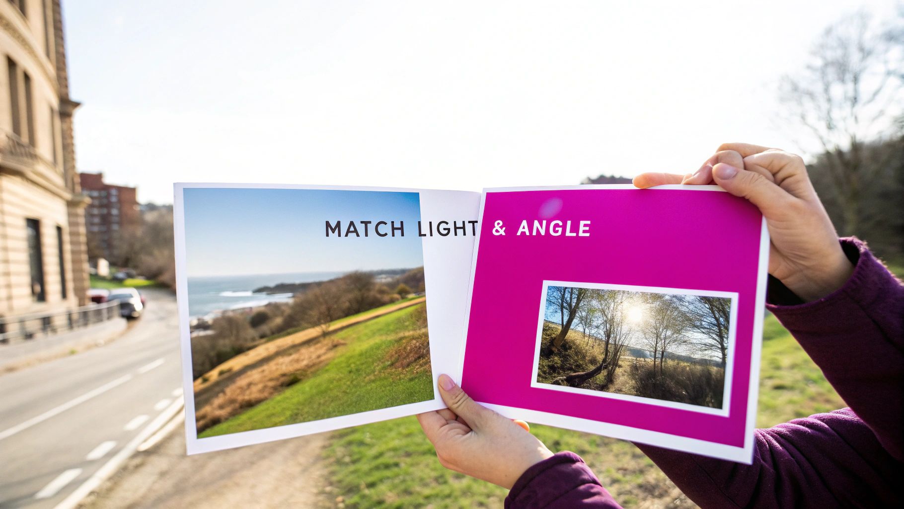
The two most critical things to get right are lighting and perspective. If you nail these, you're already halfway to a convincing result. If one photo was shot in the harsh midday sun and the other in the soft glow of dusk, they’ll never feel like they belong together. It’s a dead giveaway.
Matching Key Visual Elements
Perspective is just as unforgiving. Trying to merge a photo taken from a low angle with one shot from a drone will look instantly wrong. Our brains are incredibly good at spotting these kinds of spatial impossibilities. It's like trying to fit a square peg in a round hole.
To set yourself up for success, look for images that share a few key traits:
- Similar camera angle: Are both photos shot from eye-level, a low angle, or a high angle? Stick to one.
- Consistent light direction: Check the shadows. They should all be pointing in the same general direction.
- Cohesive color palettes: While you can always tweak colors later, starting with photos that already have similar tones will save you a ton of headaches.
Sometimes, you have the perfect primary image but just can't find a second one that fits. This is where an AI stock image generator can be a lifesaver. You can create a custom background or element that perfectly matches the lighting and perspective of your main photo.
The secret to a believable blend isn't just skillful editing; it's selecting images that were destined to be together. Pay attention to light and perspective, and you’ve already won half the battle.
Another rookie mistake is ignoring the resolution. Always, and I mean always, start with the highest-quality photos you can get your hands on. If you try to blend a crisp, high-resolution photo with a blurry, pixelated one, the final image will just look cheap and unprofessional. A good rule of thumb is to make sure your source files are at least as large as your intended final output.
To make this even clearer, here’s a quick checklist I run through before starting any blend.
Image Selection Checklist
This table breaks down the most important factors to look for when choosing your source images. A few minutes checking these boxes can save you hours of frustration down the line.
| Factor | Why It Matters | What to Look For |
|---|---|---|
| Lighting Direction | Inconsistent shadows are the fastest way to make a composite look fake. | Check for the main light source. Are shadows falling to the left? To the right? Make sure they match. |
| Light Quality | The difference between hard light (sharp shadows) and soft light (diffused shadows) is obvious. | Is the light direct and harsh (like midday sun) or soft and ambient (like an overcast day)? |
| Perspective & Angle | Mismatched angles create a jarring, "cut and paste" effect that the human eye spots immediately. | Are both shots at eye-level, from above, or from below? Keep them consistent. |
| Resolution & Quality | A low-res image will degrade the quality of the entire final piece. | High-resolution images with sharp details and no pixelation. Both images should be of similar quality. |
| Color Palette | Starting with similar tones makes the final color grading process much smoother. | Look for images with a similar mood and color temperature (e.g., warm, cool, neutral). |
Taking the time to find photos that are a natural fit is the single best thing you can do to ensure your final blend looks seamless and professional. Don't rush this part of the process
Putting AI Image Blending Into Practice
Theory is great, but let's be real—the goal is to create something visually stunning. So, let's get our hands dirty and walk through how you'd actually blend two images on a modern AI platform. This is where the abstract ideas in your head start turning into a real, tangible image.
First things first, you need your source images. Let's say you've got a cool photo of a city skyline at dusk, but the sky is just... boring. You also have a jaw-dropping image of a cosmic nebula, all swirls of purple and blue. The goal? Swap that plain sky for the vibrant galaxy. This is a classic move for turning a decent photo into a truly compelling one.
Giving the AI Your Instructions
With both images uploaded, the real magic begins in the prompt. You’re not just describing a new scene from scratch; you're telling the AI how to combine the visual information it already has from your uploads.
For our city-meets-space example, a solid prompt would be something like: "Blend the city skyline with the nebula sky, replacing the original sky completely. Make sure the city lights reflect the colors of the nebula."
This command is doing three critical jobs:
- The Action: Blend the two images.
- The Target: Get rid of the original sky.
- The Refinement: Add realistic lighting effects (the reflections).
This level of detail is miles better than just typing "combine these photos." You're actively guiding the AI's process, which gives you far more control over the final look. To see how an AI interprets these kinds of nuanced prompts, it's worth playing around with a powerful image generator that's built for it.
Dialing in the Blend Strength
Most AI tools will give you a "blend strength" or "influence" slider. Think of this as your main control knob for how much of each image shows through. A low setting might just give the original sky a subtle tint of the nebula's colors, while cranking it to 100% will completely replace it.
Getting the balance right is almost always a bit of trial and error. I usually start around a 50-60% blend strength and then tweak it from there. You’d be surprised how often the most believable composites come from a blend that isn't perfectly balanced.
Take a look at this example of digital compositing. It shows how different visual layers are stacked together to create one final, seamless scene.
This breakdown really drives home the point that a final image is often a collage of carefully integrated parts—just like our cityscape and nebula.
And this isn't just for creating fantasy art. It has incredibly practical uses. For instance, virtual staging AI uses these exact techniques to digitally furnish empty rooms for real estate listings. By getting comfortable with your prompts and settings, you can direct the AI to create polished, professional-grade composites for just about any need.
How AI Is Changing The Game For Photo Compositing
Let's be honest, blending two images used to be a massive headache. If you've ever spent hours in Photoshop painstakingly tracing around wisps of hair or trying to mask a semi-transparent object, you know the pain. Those days are quickly disappearing.
Modern AI tools are completely rewriting the rules. They don't just see pixels; they analyze the content of your photos. The AI understands context, lighting, and texture on a level that feels almost human. This allows it to perform incredibly complex selections and masking tasks in seconds—work that used to take a skilled artist ages to complete. It intelligently identifies the subject, figures out the background, and intuits how to merge them for a natural, believable composite.
What was once a multi-step, technical nightmare is now a much more straightforward process.
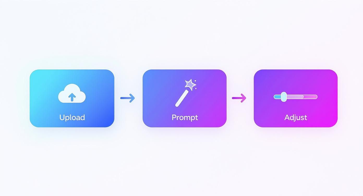
As you can see, the workflow is simple. You can go from two totally separate images to a finished blend just by uploading your files, telling the AI what you want, and maybe making a few quick tweaks.
The New Creative Frontier
This isn't just about saving time, though. It's about blowing the doors wide open on what's creatively possible. Artists can now dream up surreal scenes and impossible visuals that would have been an absolute nightmare to build manually. And this tech is moving at a breakneck pace.
Back in 2020, AI-generated images were already good enough to fool people up to 70% of the time. Think about how much better it has gotten since then. The speed at which this technology has advanced is truly incredible.
This shift lets creators spend less time bogged down in the technical weeds and more time focusing on their actual artistic vision. It’s an exciting time to be a visual creator. To get a sense of what's coming down the pipeline, you can explore our guide on AI image generation trends for 2025.
If you want to get into the nuts and bolts of the technology making this all happen, the recent news about Google Gemini Flash's image breakthrough is a great place to start.
Advanced Techniques for a Professional Polish
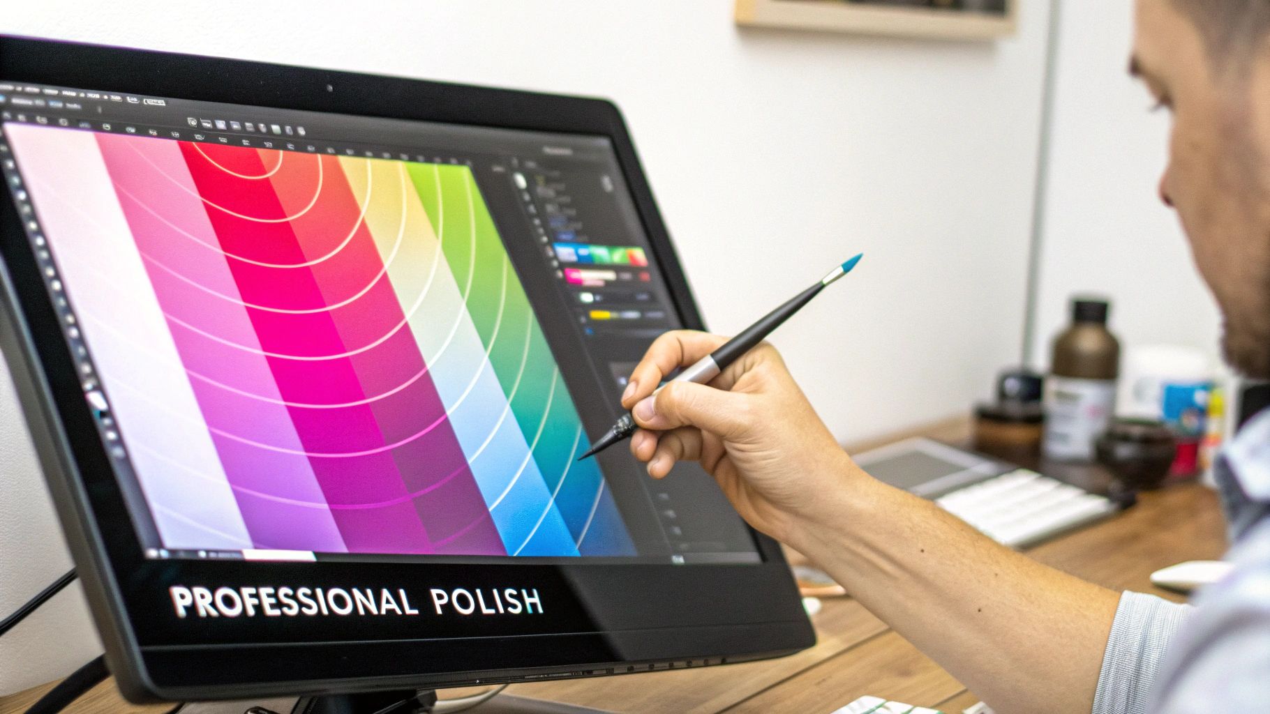
Alright, you’ve got the basics of image blending down. That's a huge step. But what separates a decent composite from one that makes people do a double-take? It's all in the final polish. These are the subtle moves that turn a technically correct image into something that feels truly alive.
Nail the Color and Texture
The biggest giveaway of a fake blend is mismatched color. This is where color grading comes in. Think of it as creating a single, unified color palette for the entire image. A faint blue tint in the shadows or a warm orange glow in the highlights can trick the viewer's eye into believing everything was shot in the same light, at the same time.
Texture is another dead giveaway. If one of your source images is tack-sharp and the other is a bit soft, the final blend will feel off. An old-school trick from my photo editing days is to add a very light, uniform layer of photographic grain over the whole thing. It sounds simple, but this tiny detail introduces a consistent texture that marries everything together beautifully.
The most convincing blends feel cohesive. Subtle adjustments to color, grain, and shadow are the invisible threads that tie two different realities together into a single, believable narrative.
Ground Your Subject with Realistic Shadows
Nothing screams "fake" faster than a poorly rendered shadow. While AI can give you a starting point, you often need to jump in and refine it manually. Think about how light works in the real world. A shadow gets softer and more diffuse the further it is from the object casting it, and it's darkest right where the object makes contact with a surface. Adding these small physical details brings a massive dose of realism.
These aren't just niche tricks for artists. In advertising, it’s estimated that over 60% of images are digitally blended or enhanced to create more striking visuals. The same logic applies to Hollywood blockbusters, where seamlessly blending real actors with digital environments is just part of the job. You can learn more about the evolution of digital photography to see how these techniques have shaped modern media.
Common Questions About Blending Images
When you're first getting your hands dirty with image blending, it's completely normal to have questions. Getting them sorted out early can save you a ton of frustration and help you dial in your technique much faster. Let's walk through some of the things people ask most often.
One of the biggest hurdles I see people run into is a simple technical one: why does a final blend sometimes look blurry or pixelated? Nine times out of ten, this comes down to using low-resolution source images. It’s a tough mistake to fix after the fact, so always start with the best quality you can get.
Another classic issue is mismatched lighting. If the light in one photo is coming from the left and it's coming from the right in the other, the final image is always going to feel… off. It’s a subtle detail, but our brains are wired to notice it instantly.
Can I Blend a Person into a Landscape?
Absolutely. In fact, it's probably one of the most popular reasons people start blending images in the first place. The real trick here is making sure the person is scaled correctly for their new surroundings. A person standing in front of a mountain range shouldn't look bigger than the mountains themselves.
To nail that believable look, keep a close eye on these three things:
- Scale and Proportion: Does the person actually fit in the scene? Adjust their size until it feels natural.
- Color Matching: You need to match the color tones of the person to the landscape's lighting. Someone shot in warm, indoor light will stick out like a sore thumb against a cool, overcast day.
- Shadows: This is a small detail that makes a huge difference. Adding a subtle shadow underneath the person helps ground them in the new environment, making it look like they truly belong there.
How Important Are the Backgrounds?
The backgrounds of your source images are incredibly important, especially if you aren't planning to replace them entirely. It’s always easier to isolate and blend a subject that has a simple, clean background—think a clear blue sky or a plain wall.
When an AI tool is blending two images, a simple background helps the algorithm better understand what the main subject is. This leads to cleaner edges and a more seamless final image, which can save you a ton of editing time down the road.
Ready to create stunning visuals without the usual headaches? With Bulk Image Generation, you can generate hundreds of high-quality images in seconds and use our advanced tools for blending, editing, and more. Start creating today at bulkimagegeneration.com.