
How to Superimpose Pictures a Pro Guide

Aarav Mehta • August 31, 2025
Learn how to superimpose pictures with pro techniques. This guide covers image selection, cutouts, blending, and lighting for realistic results.
Superimposing a picture is really just a fancy way of saying you're layering one image on top of another. It’s a foundational trick in any creative’s toolkit, perfect for making everything from eye-catching social media posts to slick ad campaigns.
The basic idea is simple: you combine elements from different photos into one seamless scene.
What It Means to Superimpose an Image
At its heart, superimposing is about telling a new story. You start with a background image, find a foreground subject you want to add, and then carefully place it into the new environment.
The real magic, though, is in the details—fiddling with the size, position, and colors until the two images look like they were always meant to be together. Get it right, and nobody will ever know they started as separate photos.
This isn’t some new digital trick, either. The concept has been around since the earliest days of photography. Back in 1854, a photographer named André-Adolphe-Eugène Disdéri figured out how to create multiple images on a single photographic plate, which was a pretty clever precursor to the layering we do with software today. If you're into that stuff, you can dig into the history of early camera innovations.
When you get good at this, you can:
- Create powerful visual narratives by mixing elements that were never in the same room.
- Design unique marketing assets that stop people from scrolling.
- Give your personal photos a creative boost by swapping out a boring background for something spectacular.
Before we jump into the "how-to," let's quickly map out the main stages of the process. Think of it as a quick cheat sheet for what's ahead.
Core Steps in the Superimposition Process
Here’s a high-level look at the key stages you'll go through when layering your images. From getting your files ready to making those final tweaks, this table breaks down the entire workflow.
| Stage | Key Action | Objective |
|---|---|---|
| Preparation | Select your background and foreground images. | Choose high-quality, compatible images that will blend well together. |
| Isolation | Cut out the foreground subject from its original image. | Create a clean, sharp cutout of your subject with no background residue. |
| Layering | Place the cutout subject onto the new background. | Combine the two images into a single composition within your workspace. |
| Adjustment | Resize, reposition, and rotate the subject. | Ensure the subject fits naturally within the new scene's scale and perspective. |
| Blending | Match colors, lighting, and shadows. | Make the foreground subject look like it truly belongs in the new environment. |
| Final Touches | Add filters, effects, or final color corrections. | Polish the final image for a cohesive and professional look. |
Understanding these core steps helps demystify the process. It’s not one single action but a series of small, deliberate adjustments that lead to a convincing final image. Now, let’s get into the specifics.
Choosing the Right Images for a Perfect Blend
 A truly believable composite image is made long before you even open your editing software. The real secret to a final product that looks intentional—not just slapped together—is choosing the right source photos from the get-go.
Think of it like casting actors for a movie. They need to look like they belong in the same world. This means paying close attention to a few core elements that can make or break your final image. Honestly, getting this right from the start will save you hours of frustrating edits down the line.
Matching Core Visual Elements
The biggest giveaway of a poorly superimposed picture is almost always mismatched lighting. If your background scene has a bright sun coming from the right, but your subject is clearly lit from the left, the illusion is instantly shattered. You have to analyze the light source in both photos.
- Lighting Direction: Where is the main light coming from? Make sure the shadows on your subject fall in the same direction as the shadows in the background. It's a dead giveaway if they don't.
- Perspective and Angle: A person photographed from a low angle is going to look completely bizarre when you drop them into a scene shot from high above. For a seamless blend, it's critical to consider the original camera perspectives. If you're new to this, it’s worth understanding camera angles to get a better feel for it.
- Image Resolution: This one’s a classic mistake. Never, ever mix a blurry, low-resolution photo with a tack-sharp, high-quality one. The difference in quality is immediately jarring and just screams "fake." Aim for images with similar sharpness and detail.
The ability to manipulate and overlay digital photos is built on a simple but powerful foundation: the pixel. This concept became a reality in 1957 when Russell Kirsch scanned the very first digital image, a 176×176 pixel photo of his infant son. Learn more about the historical milestones of digital imaging.
By focusing on these three pillars—lighting, perspective, and resolution—you're building a solid foundation. This initial bit of care is what transforms the technical steps of superimposing a picture from a tedious chore into a genuinely creative process.
Getting Clean Cutouts with Image Masking
If you want to superimpose pictures and have them look believable, you have to nail the cutout. This is probably the single most important technical step. A clean, crisp cutout is the foundation for a professional-looking image; a sloppy one just screams "fake." This is where we need to move past the quick-and-dirty automatic tools and really take control.
Forget the magic wand tool for a minute. Sure, it’s handy for simple, solid-colored backgrounds, but it falls apart the second you throw complex edges at it. For results that don't look like a cheap collage, you need to get comfortable with more precise methods, especially when you're dealing with tricky details like wisps of hair, fuzzy fabric, or anything semi-transparent. This is where the real skill comes in.
The Power of Layer Masks
Your most powerful tool for this job is the layer mask. Instead of permanently deleting pixels when you cut something out (a rookie mistake!), a layer mask lets you hide or show parts of a layer without destroying the original image. Think of it like a digital stencil: you can paint with black to hide parts of the layer and paint with white to bring them back.
Working this way is a game-changer because it’s non-destructive. You can tweak your selection over and over again without ever damaging the original photo. If you accidentally erase too much of an edge, just switch your brush color and paint it right back in. Simple as that.
This workflow visualizes the basic steps for prepping your images before you even think about superimposing them.
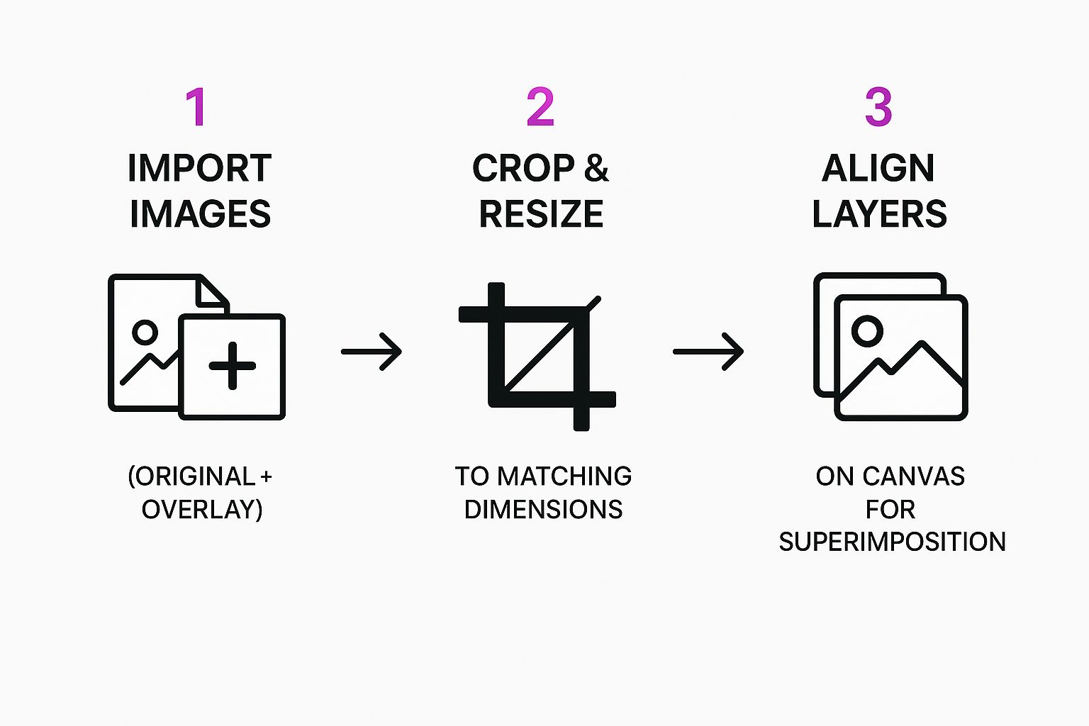
As you can see, the core process involves getting your layers imported, sized, and aligned before you dive into the detailed masking work.
Techniques for Flawless Edges
Getting a clean edge that doesn't look like a harsh sticker pasted onto a background takes a bit of finesse. The whole point is to make the subject look like it actually belongs in the new scene.
Here are a few tips I've picked up over the years:
- Feather Your Selection: Applying a very slight feather (softening) to the edge of your mask helps it blend more naturally into the new background. Even a tiny feather of just 1-2 pixels can make a world of difference.
- Refine Difficult Edges: For the really tough stuff like hair or fur, most decent editing software has "Refine Edge" or "Select and Mask" tools. These are specifically designed to intelligently find and isolate those super-fine details.
- Vary Your Brush Hardness: Don't just use one brush setting. A soft-edged brush is great for gentle transitions, but you'll want a hard-edged brush for sharp, defined objects like buildings or cars.
A clean cutout is what separates a composite that feels intentional from one that looks like a cheap collage. Mastering layer masks gives you the power to make pixel-perfect adjustments, ensuring every single edge is exactly how you want it.
For more advanced background removal, especially if you're working with subjects shot against a solid color, it's worth exploring dedicated green screen techniques. Of course, modern tools, including AI-powered ones, have made this whole process much easier. If you want to see what automated options can do, you can play around with an AI image generator, as many now come with built-in background removal features. By combining these manual and automated techniques, you'll be ready to tackle just about any masking challenge.
Composing and Blending Your New Image
Alright, you've got a clean cutout ready to go. Now the real fun begins. This is where you move past a simple cut-and-paste job and start creating a scene that feels completely believable.
The first step is mechanical, but it's absolutely crucial: getting the scale and position just right.
Think about perspective for a second. An object that's meant to be far away needs to be smaller, while anything closer should be larger. Take a good look at your background image and figure out where your subject would logically fit. Don't be afraid to resize and drag it around a few times. You'll know it's right when the sense of depth just feels natural.
Matching the Scene's Vibe
Once your subject is placed, the next puzzle is making it look like it actually belongs there. A subject shot in warm, golden-hour light will stick out like a sore thumb in a cool, blue-toned scene. This is where adjustment layers become your best friend.
Instead of making permanent, destructive changes to your cutout, adjustment layers sit on top, affecting everything below. It’s a non-destructive workflow that gives you total freedom to fine-tune the color and lighting.
- Color Balance: This is your go-to for matching color temperature. Is the background warm? Add some yellows and reds. Is it cool? Bump up the blues and cyans.
- Brightness and Contrast: Use these to make sure your subject isn't weirdly brighter or darker than its new surroundings. It needs to melt into the scene's existing light.
- Hue and Saturation: Perfect for dialing back an overly vibrant subject or, conversely, boosting its colors to match a more vivid background.
The real goal here is to make the lighting and color on your subject totally indistinguishable from the background. Each tweak should be subtle, building up a cumulative effect that tricks the viewer's eye into accepting the new reality you've just built.
Using Blending Modes for Creative Effects
Blending modes are a secret weapon for integrating layers in more interesting ways. While 'Normal' is the default, playing around with the other options can unlock some incredible results.
For example, switching to 'Overlay' or 'Soft Light' can help your subject pick up some of the color and texture from the background, which goes a long way in unifying the final image. A strong composition is what ultimately tells a story. For some killer inspiration on how combined images create powerful narratives, check out the work of top visual storytelling design agencies.
You can also see how these same principles of composition and blending are used when you create stunning digital product images using AI generators.
Adding Realistic Shadows and Final Touches
We're almost there, but this next part is what separates a good composite from a great one. An object without a shadow just looks wrong—it feels like it’s floating in space, and that instantly shatters the illusion you've worked so hard to build. This final stage is all about selling the composite and making your superimposed picture look completely real.
The secret? Let the background image dictate the shadow. You have to play detective for a moment. Look closely at your scene and figure out where the primary light source is. Is the light harsh and direct, creating sharp, defined shadows? Or is it soft and diffused, resulting in gentle, blurry ones? Your background holds all the clues.
Crafting a Believable Shadow
Once you’ve got a handle on the lighting, it’s time to actually build the shadow. I always do this on its own separate layer, slid right underneath the subject layer. This is a non-negotiable step because it gives you total freedom to tweak and adjust the shadow without messing up any other part of your image.
Here's a simple workflow that I've found incredibly effective:
- Create the Shape: Start by making a rough selection of your subject. On your new shadow layer, fill that selection with black.
- Position and Distort: Now, use the transform tools to skew, stretch, and position that black shape so it looks like it's being cast away from the light source. Think about how a real shadow would fall on that surface.
- Blur and Refine: This is where the magic happens. Apply a blur filter to soften the shadow’s edges. A stronger blur is perfect for mimicking soft light, while just a touch of blur works for harsher, more direct light.
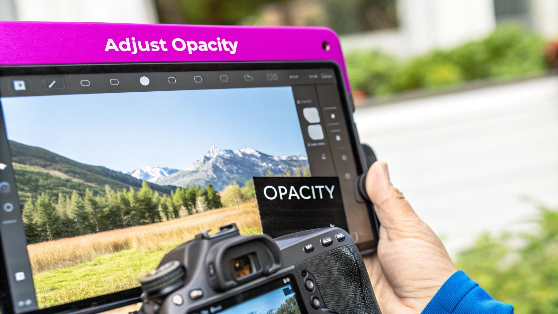
- Adjust Opacity: Real shadows are rarely pitch-black. Drop the layer’s opacity until it blends naturally into the background. You’re aiming for subtle, not solid.
Adding a realistic shadow is the single most important detail that connects your subject to its new environment. It’s what grounds the object in reality and tricks the eye into believing it was always there. Don't skip this.
The final flourish is a unifying color grade. By applying a subtle photo filter or a gradient overlay across the entire image—background and foreground included—you tie all the different elements together. This simple step ensures a consistent color palette and is the last thing you need to do to superimpose pictures like a pro.
Common Questions About Superimposing Pictures
When you're just starting to superimpose pictures, it's totally normal for a few questions to pop up right away. Getting a handle on these common hurdles will save you a ton of time and let you get back to the fun, creative part of the project.
So, what's the first thing everyone asks? "What's the best software?" For absolute, pixel-perfect control, Adobe Photoshop is still king. It's just packed with advanced tools. But you don't always need that kind of firepower. Powerful free options like GIMP exist, and for simpler tasks, web-based editors like Photopea or Canva are fantastic. The "best" tool really just depends on what you’re trying to accomplish.
How Do I Make It Look Real?
This is the big one. Making a composite image look believable can feel like a magic trick, but it really boils down to getting a few key principles right.
- Matching Light: The light source hitting your subject has to line up with the light source in the background. It's the most common giveaway.
- Consistent Perspective: Don't drop a subject shot from a low angle into a background photographed from above. Our brains know it's wrong, even if we can't explain why.
- Color Harmony: A quick color correction pass is crucial. You need to make sure the warmth, saturation, and tones are consistent across every single element.
The secret to a truly convincing composite isn't just one thing—it's the combination of perfectly matched light, perspective, and color, all tied together with a realistic shadow.
Finally, people often wonder if they can pull this off on their phone. Absolutely. Mobile apps like Picsart and Snapseed have surprisingly robust layering and masking features, often with AI tools that can remove a background in one tap. They're perfect for creating impressive images on the go.
For more professional results, especially in e-commerce, our guide on AI product photography dives deeper into how these same principles apply.
Ready to create stunning visuals in seconds? With Bulk Image Generation, you can generate hundreds of high-quality images effortlessly. Start creating for free today!