
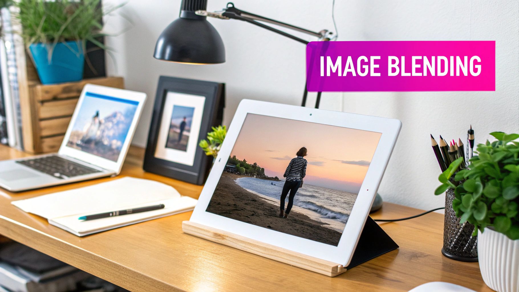
How to Blend Two Images: Easy Tips for Perfect Composites

Aarav Mehta • September 8, 2025
Learn how to blend two images seamlessly with our quick guide. Discover expert techniques to create stunning composite images today!
Blending two images is about more than just slapping them together in some software. To really sell the effect, you have to get the details right. It’s a delicate dance of matching light, color, and perspective to create a single, cohesive scene that just feels right. The real goal is to trick the eye into believing the merged elements were always part of the same picture. Luckily, the tools we have today make this process surprisingly straightforward.
The Art of Believable Image Blending
Learning how to blend images is really about learning to tell a visual story. You're not just mashing pixels; you're crafting a new reality. Maybe it's a wild, fantastical landscape or a polished product mockup for a client. Before AI came along, this was a painstaking art form that required hours of manual work in complex software.
The craft has deep roots, going all the way back to early photographers who used clever techniques like double exposures on film to merge different scenes. If you’re curious, you can discover more about the history of photographic manipulation and see just how far we've come.
Even though the tools have evolved dramatically, the core principles haven't changed a bit. A successful blend still hangs on a few key elements that work together to create a believable illusion.
Core Principles for a Seamless Blend
To make your composite image look natural and not like a cheap cutout, you need to nail these foundational concepts. Get these right, and you're 90% of the way there.
- Consistent Lighting: Make sure the light source in both images appears to come from the same direction. If one subject is lit from the left and the other is lit from the right, the final image will feel jarring and fake. It's an instant giveaway.
- Matching Perspective: The camera angles have to line up. You can't merge a photo taken from a low angle with one shot from a bird's-eye view and expect it to look right. The illusion will shatter immediately.
- Harmonious Color and Tone: The colors and overall mood need to mesh. A warm, golden-hour photo won't blend smoothly with a cool, blue-toned image without some serious color correction.
Mastering these three pillars—light, perspective, and color—is what separates a simple collage from a compelling, unified visual narrative. It's the difference between amateur and pro.
To help you keep these concepts top of mind, I've put together a quick-reference table. Think of it as a checklist for every blend you create.
Key Principles for Realistic Image Blending
| Principle | Why It Matters | Quick Tip |
|---|---|---|
| Consistent Lighting | Mismatched light sources create unnatural shadows and highlights, immediately breaking the illusion of a single scene. | Look at the shadows. Do they fall in the same direction? Is the light hard or soft in both images? Match them. |
| Matching Perspective | If the angles don't align, objects will look like they are floating or distorted, making the composition feel "off." | Pay attention to the horizon line and vanishing points. They should be consistent between both source images. |
| Harmonious Color | Clashing color temperatures (warm vs. cool) or saturation levels make the combined elements look out of place. | Use a color picker to sample colors from both images. Adjust the temperature, tint, and saturation of one image to match the other. |
Thinking about these principles gives you a clear roadmap for the entire process. It turns blending from a purely technical task into a creative one, helping you make intentional choices that lead to professional-looking results every single time.
Choosing Your Images for a Perfect Blend
Honestly, the success of your blended image is decided long before you even touch a blending tool. The single most important part of the process is picking the right source photos. It’s all about finding two images that not only look good on their own but also share some fundamental visual DNA.
Think of it like casting actors for a movie; you need chemistry. It’s the same with images. You can’t just cram any two pictures together and expect a seamless result. A little bit of foresight here will save you hours of frustrating tweaks down the road.
Matching Light and Perspective
The two dead giveaways of a bad composite are mismatched lighting and clashing perspectives. If the light in one photo is coming from the top-left and in the other from the bottom-right, the final image will feel instantly wrong. The human eye is incredibly sharp at spotting these kinds of inconsistencies, even if we can't always explain why.
Before you get attached to a pair of images, ask yourself a couple of quick questions:
- Where is the light coming from? Pinpoint the main light source in both shots. Is it hard, direct sunlight that creates crisp shadows? Or is it soft, diffused light from an overcast day?
- What was the camera angle? Was each photo shot from eye-level, a low angle looking up, or a high angle looking down? A subject photographed from below will never look natural when dropped into a scene shot from above.
Trying to merge a studio portrait taken with a softbox into an outdoor landscape under the harsh midday sun is just asking for trouble. The lighting cues are just too different to reconcile.
The real goal is to find images that feel like they were shot in the same place, at the same time, under the same conditions. Nailing the light and perspective does 90% of the heavy lifting for you, making the technical blending part a breeze.
Harmonizing Color and Subject
Beyond the technical stuff like light and angles, you have to consider the overall mood and color palette. Images with complementary colors will naturally fuse together more smoothly. A photo with warm, golden-hour tones will merge beautifully with another shot in a similar color scheme, but it's going to clash hard with a cool, blue-tinted image.
Don't have the perfect photos on hand? No problem. You can just generate a new one to match. Our free AI image generator can help you create a custom background or foreground element with the exact lighting and style you need for a perfect blend. It gives you complete creative control.
Putting It All Together: Your Guide to Blending Images
Okay, you’ve picked out your two images. Now for the fun part—actually merging them into a single, cohesive piece. This is where the real artistry comes in, moving past the technical selection and into the creative choices that will make or break your final image.
Think of it less like following a recipe and more like mixing paint. You're telling the software exactly how you want the pixels from each image to interact with one another. It’s a process that used to be a complex, almost magical art form confined to darkrooms. Today, digital tools have made it incredibly precise and accessible. By 2020, platforms like Adobe Photoshop had already attracted over 13 million subscribers, giving everyday creators access to powerful techniques like layer masking and gradient blending.
Getting to Know Your Blend Modes
The main tool you’ll be working with is the blend mode. Don't get intimidated by the term; each mode is just a different formula for how your two layers will combine. You don't need to know the math, just the visual outcome.
For example, a ‘Multiply’ blend mode will always darken the final image. It’s fantastic for overlaying textures onto a surface or adding graphics to a photo because it preserves the shadows and creates a really rich, deep look.
On the flip side, the ‘Screen’ blend mode does the exact opposite. It brightens everything up, creating these beautiful, luminous effects. This is my go-to for adding things like lens flares, atmospheric mist, or even glowing text. The best way to learn is simply to experiment—toggle through the different modes and see what each one does to your specific images.
How to Get Those Soft, Seamless Transitions
Nothing screams "fake" faster than a hard, visible edge where two images meet. To get that professional, seamless look, you'll need to master two key controls: opacity and feathering.
Opacity is just a fancy word for transparency. It controls how much of the top layer you can see. If you’re going for a very subtle effect, you might only need 10-20% opacity, which lets the bottom image gently peek through. For a more dramatic overlay, you might push it up to 80% or more.
Feathering, meanwhile, is what softens the edges of a selection. Instead of a sharp, cut-out line, it creates a gradual fade. This is absolutely essential if you're, say, replacing a boring sky or trying to merge a person into a new background without that clunky "pasted-on" feel.
If you really want to get into the weeds of layering and creating complex composites, this guide on how to superimpose pictures like a pro is a great next step. And for anyone focused on e-commerce, don't miss our tutorial on https://bulkimagegeneration.com/blog/en/tutorials/how-to-create-stunning-digital-product-images-using-ai-generators-5-digital-product-image-prompt-examples.
This little graphic breaks down the basic workflow pretty well.
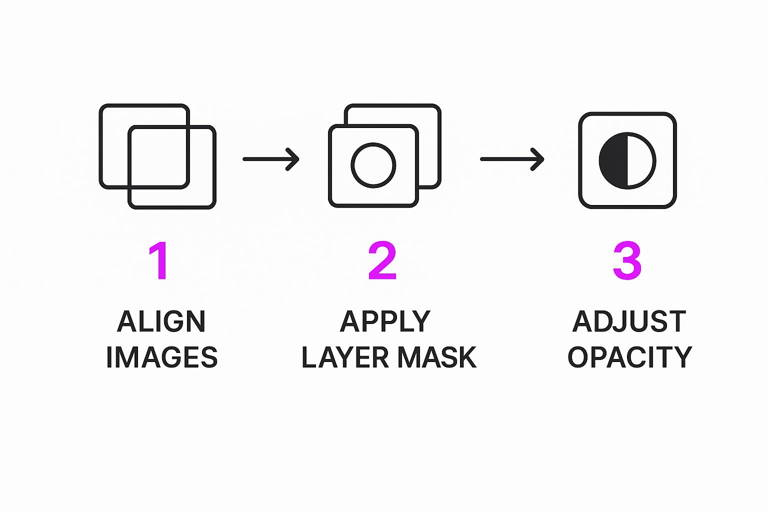
You can see how each step, from getting the images aligned to masking and tweaking the final opacity, builds on the last one to create something that looks completely natural.
Refining Your Blend with Advanced Adjustments
Getting your images merged is really just the first step. The real magic—what separates a quick composite from a believable piece of art—happens in the fine-tuning. This is where you make the final piece feel intentional and authentic.
The biggest giveaway of a sloppy blend is mismatched lighting and color. If one of your source images was shot in the warm glow of a sunset and the other under harsh office fluorescents, it's never going to look right. The goal is to make them feel like they belong in the same world, captured at the very same moment.
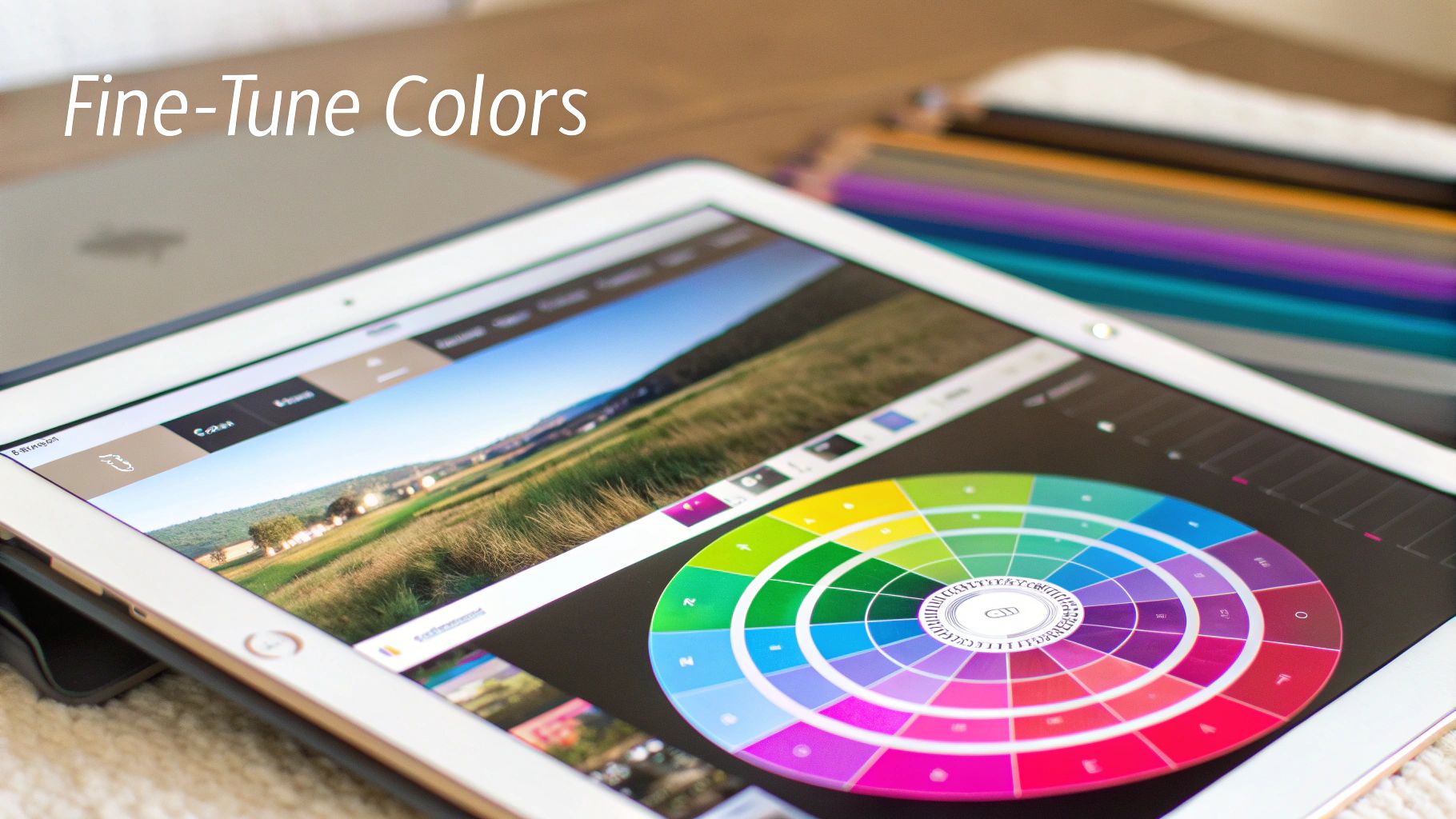
Matching Color and Tone for Realism
First thing's first: tackle the color temperature. Take a hard look at your layers. Does one feel warmer (more yellows and oranges) while the other leans cooler (more blues)? You’ll want to find a middle ground. Nudge the sliders until both images feel like they’re living under the same sky.
With the temperature set, turn your attention to brightness and contrast. An image that’s super punchy and high-contrast just won't sit right next to something soft and muted. Make subtle tweaks here and there until the light intensity feels consistent across the entire canvas.
The most convincing blends live and die by their color harmony. When the light and color feel unified, the viewer's brain just accepts the new reality you've created. No questions asked.
This whole process is way easier than it used to be. Today's tools use sophisticated algorithms that can slash image artifacts by over 70% compared to older methods.
And don't forget you can make selective adjustments. It's rare that an entire image needs a uniform change. Sometimes, you just need to brighten a specific shadow in one corner or tone down a distracting highlight in another. These little tweaks guide the viewer's eye and give your work a polished, professional feel.
For a truly next-level composite, you might even explore AI style transfer techniques. This is where you can merge the entire aesthetic of one image with the subject of another, creating some seriously sophisticated and unique blends.
Common Blending Mistakes and How to Avoid Them
Learning how to blend two images is part art, part science, and a whole lot of trial and error. Even seasoned pros make mistakes, but knowing what to watch out for from the start can save you hours of headaches and get you to a seamless final image much faster.
One of the first things that trips people up is the light source. If the light in one of your photos is coming from the left and in the other it's coming from the right, the final image is going to feel off. The human eye is incredibly sharp at catching these kinds of inconsistencies, and it's a dead giveaway that the image has been manipulated. Before you even start, take a minute to look at both of your source images and see where the shadows fall.
Creating Realistic Transitions
Another mistake that just screams "amateur" is having hard, obvious edges where the two images meet. This usually happens when you cut out an object without softening—or feathering—the selection. That harsh line immediately shatters the illusion you're trying to build. The real goal is a gradual, almost invisible transition that makes every element look like it belongs there.
The most convincing blends are the ones you don't notice. Success means making your edits so subtle and natural that the viewer accepts the final image as a single, cohesive reality.
Quick Fixes for Common Problems
To help you sidestep these common issues, here are a few practical tips I've picked up over the years:
- Mismatched Lighting: Before you even think about blending, jump into your color correction tools. Adjust the warmth, coolness, and brightness of one image until it feels like it lives in the same world as the other.
- Harsh Edges: This one is easy. Always apply a slight feather to your selections. Seriously, even a 1-2 pixel feather can be the difference between a jarring cut-out and a soft, believable edge.
- Unrealistic Color Palettes: Pay close attention to color harmony. A subject pulled from a vibrant, warm photo won't look right when dropped into a cool, muted scene without some serious color grading to make it fit in.
For anyone working with product visuals, getting these skills down is non-negotiable. We actually dive a lot deeper into this in our guide to creating stunning AI product photography, which is packed with advice for making your composites look absolutely professional.
Common Questions About Blending Images
Even after you get the hang of blending two images, a few questions always seem to pop up. I see these all the time from creators who are just getting started, so let's clear up some of the most common ones.
What’s the Best Resolution to Start With?
Always, always start with high-resolution images. It makes everything downstream so much easier. While there isn't one perfect number, a solid rule of thumb is to make sure both of your source images are at least 1920 pixels on their longest side. This gives the AI plenty of detail to work with and helps you avoid that dreaded pixelated look when you resize or tweak things later.
Trust me, trying to blend a low-resolution photo is a recipe for a blurry, unprofessional mess. You can always scale a big image down without losing quality, but you can't really scale a small one up and expect it to look crisp.
Can I Blend Images Taken in Different Lighting?
You absolutely can, but be warned: this is where the real artistry comes in. Merging a photo shot in harsh midday sun with one from a softly lit room is one of the trickiest things to get right. It takes a lot of careful color correction. You'll have to meticulously balance the brightness, contrast, and color temperature to make the final image feel believable.
Your success here boils down to one thing: can you unify the color and tone? The goal is to make both images feel like they exist in the exact same environment.
Which Blend Mode Should I Use?
There's no single "best" blend mode—it completely depends on what you're trying to achieve. That said, I find that most beginners gravitate toward a few workhorses:
- Multiply: This is my go-to for darkening an image or adding textures, like laying a paper grain effect over a photo or deepening shadows.
- Screen: The exact opposite of Multiply. It's perfect for brightening a scene, adding light effects like lens flares, or creating those cool, ethereal glows.
- Overlay: This one is a versatile middle ground. It punches up the contrast, making light areas lighter and dark areas darker, which is great for adding a bit of drama.
The best advice I can give is to just play around. Cycle through the different modes and see what happens. You'll often discover an effect you didn't even know you were looking for.
Ready to create stunning, professional-quality visuals in seconds? With Bulk Image Generation, you can generate and blend images effortlessly using advanced AI. Describe your vision, and let our tools handle the rest. Try it now and see how easy it is: https://bulkimagegeneration.com