Generating Consistent Icon Sets and Logo Concepts in Bulk

Ryan Bennett • September 18, 2026
How game developers, founders, and course creators use bulk AI generation to produce a whole set of matching icons, logos, or brand assets in one pass, instead of one-off images that don't match each other.
Generating Consistent Icon Sets and Logo Concepts in Bulk
Indie game developers, early-stage founders, and course creators share a problem that has nothing to do with each other's industries: they all need a set of small visual assets that look like they belong to the same family — and a single one-off image generation almost never gets there. Ask for "a fire icon," then separately for "an ice icon," and you'll get two different art styles, two different lighting setups, two different levels of detail. Batch generation fixes this by generating the whole set together, against one style description.
Who's actually doing this, and why
- Indie game developers need an upgrade or ability icon set that reads as one visual language in the UI — players notice immediately if one icon looks like it came from a different artist.
- Founders exploring brand identity before briefing a designer, generating a spread of logo directions to react to so they can walk into that conversation already knowing whether they want geometric or organic, wordmark or symbol.
- Course creators and personal brands building the small recurring assets a launch actually needs — an Instagram highlight cover set, a promo banner for the course itself — where the point isn't any single image, it's that every asset in the brand kit matches.
All three are doing the same thing for different reasons: getting a coordinated set, not a single hero image, because the assets will sit next to each other in a UI, a profile, or a landing page.
Game asset icon sheets
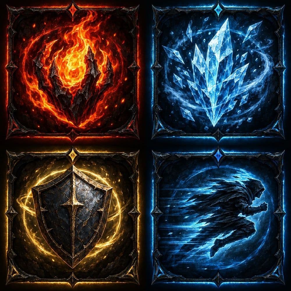
The request pattern here is usually a themed upgrade or ability set — one game, one visual language, several effects:
A set of four dark fantasy RPG upgrade icons in one consistent hand-painted style, arranged in a grid, each icon representing a different power (fire, ice, shield, speed), dark moody color palette, glowing magical rim light, square icon format, game UI asset sheet.
Generating the full set in one request — rather than one icon per prompt — is what keeps the lighting, palette, and rendering style locked together across the whole sheet.
Logo concept exploration
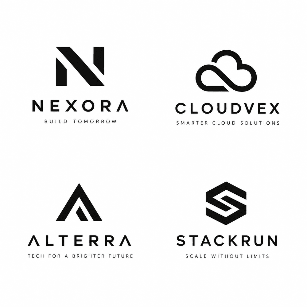
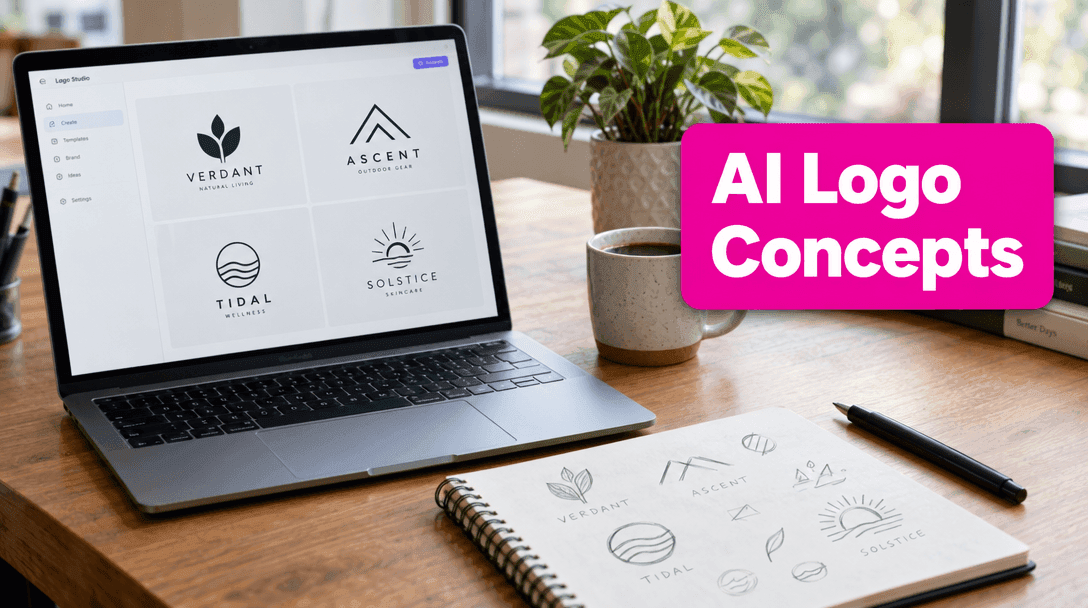
Founders use the same trick earlier in the process, before a designer is even in the room: generate a spread of distinct logo directions to react to, rather than commissioning one idea at a time.
A set of four minimalist tech startup logo concepts arranged in a grid, sleek modern geometric lines, flat vector style, monochrome black on white background, clean brand identity presentation.
None of these are meant to be the final logo — they're a fast way to find out whether you want geometric vs. organic, wordmark vs. symbol, before you brief a human designer or spend real budget.
Personal-brand and course marketing kits
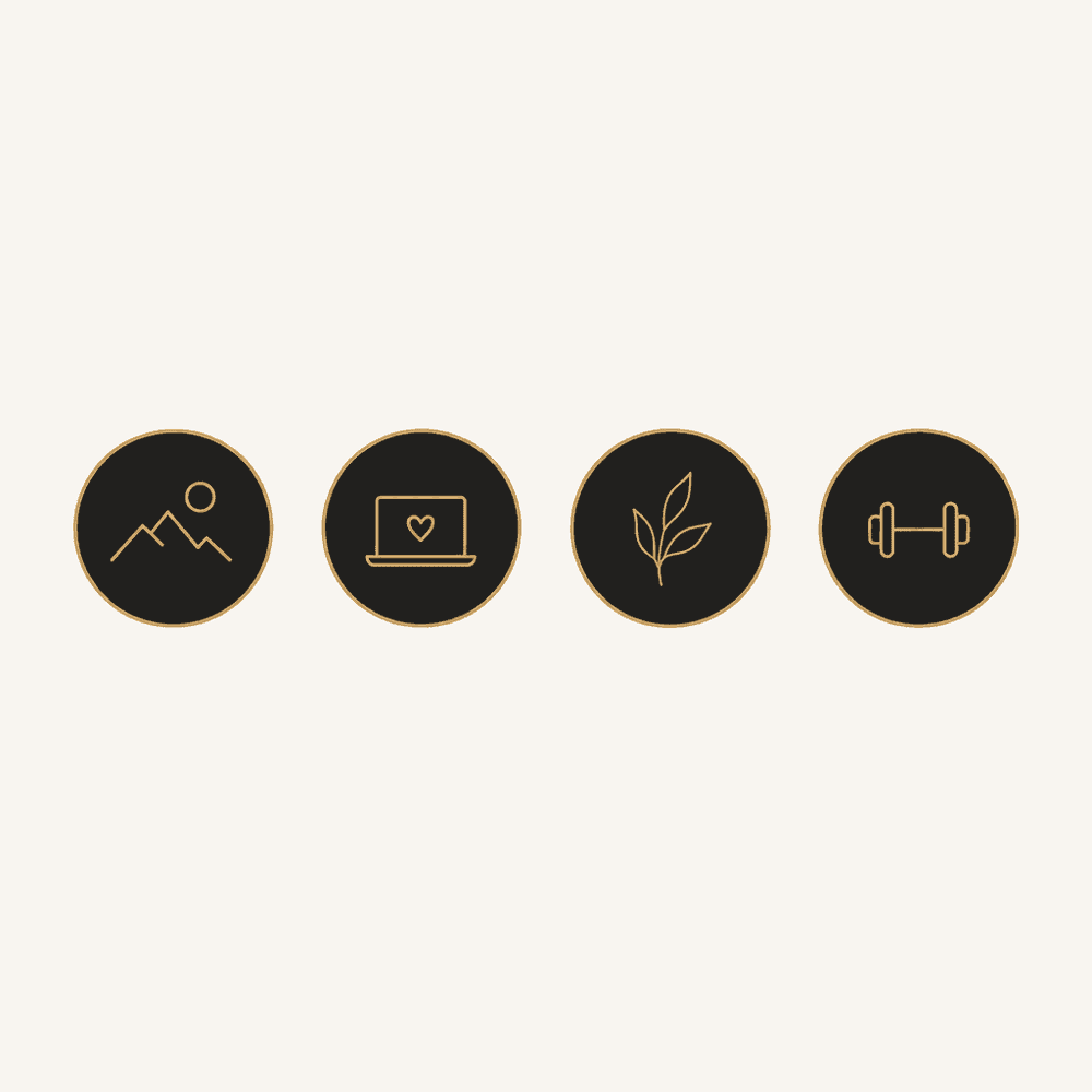
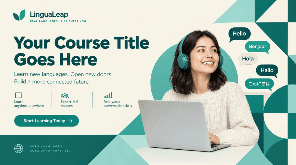
The same batching logic shows up outside product design entirely: a solo creator launching a course or building a personal brand needs a handful of coordinated assets — social highlight covers, a promo banner — that share one color palette and one visual voice, generated together so nothing looks bolted on.
A premium Instagram highlight cover icon set: four minimal circular icons in a consistent dark elegant color palette with thin gold line-art symbols, arranged in a row, cohesive personal brand aesthetic.
Which model to use
Ideogram is the strongest pick here whenever a logo concept includes a wordmark — it renders legible text far more reliably than Midjourney or Stable Diffusion, which is usually exactly where logo-concept generation falls apart. For icon sets that don't need text, Flux keeps rendering style locked across a grid better than most general-purpose models. Compared to sketching concepts yourself in Canva or briefing a first round on a freelance marketplace, generating the whole spread in one batch gets you the "which direction do I even want" signal in minutes instead of days.
Tips from real batches
- Ask for the full set in one prompt when style consistency matters more than getting the "best" single result. A grid request keeps rendering style locked across every item.
- Name the shared constraints, not just the subject: color palette, line weight, lighting, background — these are what make a set read as one family instead of four random images.
- Treat icon/logo output as a direction-finder, not a deliverable. Vector cleanup, and any trademark or brand clearance, still needs a human pass before anything ships.
- For game assets, describe the effect, not just the object — "glowing magical rim light" does more for visual consistency than naming the icon subject alone.
- For marketing kits, generate the set your launch actually needs, not one image at a time — a highlight cover set and a promo banner in the same request keep the palette identical without you having to re-specify it.
Same underlying idea as coloring books and product shots: one style, applied across many subjects, generated together instead of one at a time.