Turning Lesson Plans into Custom Classroom Illustrations, Fast

Ryan Bennett • September 18, 2026
How teachers and course creators use bulk AI image generation to produce a full set of custom diagrams, posters, and explainer illustrations for a lesson in one sitting.
Turning Lesson Plans into Custom Classroom Illustrations, Fast
Stock illustration sites rarely have the exact diagram a lesson needs — "how cloud computing works" for a specific grade level, or a calculus explainer that matches one textbook's visual style. Teachers and course creators end up needing several custom illustrations for a single lesson or slide deck, all sharing one clean, classroom-appropriate visual style. That's a batch job, not a one-off.
Who's actually doing this, and why
- Teachers building one specific lesson's slide deck need several diagrams that all look like they belong to the same deck — cloud computing one week, the water cycle the next — where consistency across slides matters more than any single image being a masterpiece.
- Teachers preparing something to print or display, not just present — a motivational poster for the classroom screen, a printable worksheet — where the output has to survive being blown up or printed, not just shown on a laptop.
- Course creators outside traditional education (a language course, a professional training deck) using the same "concept + visual metaphor + style lock" recipe to explain a specific idea their audience won't find pre-made stock art for.
What unites them: none of these are searching for an illustration. They're producing everything one lesson needs, in one sitting, so it reads as a single deck instead of a collage of stock photos.
The pattern
Requests in this category tend to name three things every time: the concept to explain, the audience, and a "flat, minimal, infographic" style constraint that keeps the slide deck from looking like it was assembled from five different clip-art sources.
Clean modern flat-style digital illustration for a classroom slide explaining how cloud computing works: a glowing cloud icon above a small city skyline, dotted connection lines linking it to a laptop and a phone, minimal color palette, educational infographic style.
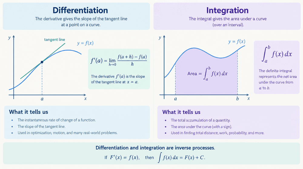
Professional minimalistic flat vector illustration explaining calculus differentiation and integration: a smooth curve with a tangent line and shaded area underneath, clean geometric shapes, soft pastel color palette, educational textbook diagram style.
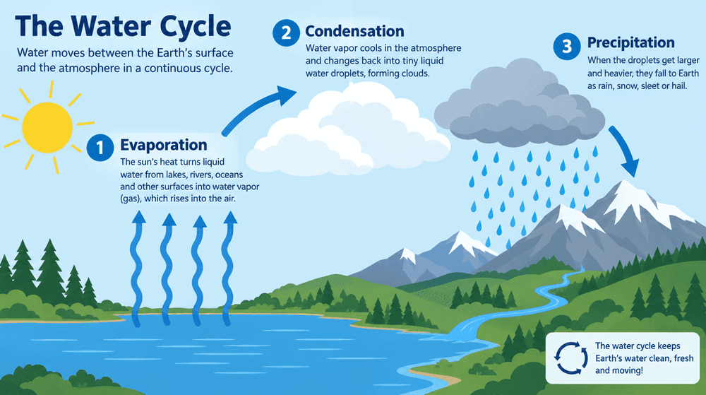
Clean flat vector illustration diagram explaining the water cycle for a middle school science class: labeled arrows showing evaporation, condensation and precipitation over a landscape with mountains, clouds and a lake, minimal color palette, educational textbook style.
All three follow the same recipe: concept → visual metaphor → explicit style lock. Swap the concept per slide and keep the style sentence fixed, and a 10-slide deck comes out visually consistent.
Beyond slides: posters and printables
The same style-locked approach works for anything that leaves the slide deck — a motivational poster sized for a classroom screen or a printed wall, built with the same "flat, bold, readable at a distance" constraints a diagram needs, just with a bigger title area and simpler shapes so it still reads from the back of a room.
Which model to use
Diagrams usually need legible in-image labels — arrows, short captions inside the illustration — which is where ChatGPT Image 2 and Ideogram have a real edge over Midjourney or Stable Diffusion, both of which are still unreliable at rendering readable text inside an image. Canva has templates for generic diagrams, but not for "the water cycle explained for a 6th grader with exactly this visual metaphor" — that specificity is the actual gap this fills, and it's a prompt problem, not a template problem.
Tips from real batches
- Name the visual metaphor, not just the topic. "How cloud computing works" is vague; "a cloud floating above a city with connection lines to devices" tells the model exactly what to draw. The more concrete the metaphor, the more useful the diagram.
- Lock a style sentence and reuse it across the whole deck — "flat, minimal, educational infographic style" (or "flat vector, pastel, textbook style") is what keeps 10 slides from looking like 10 different sources.
- State the audience level. A diagram for a children's classroom and one for a university lecture need different amounts of detail — say so in the prompt rather than hoping the model guesses.
- For anything that gets printed or displayed large, say so. "Designed for display on a classroom screen or printed poster" pushes toward bolder shapes and bigger text than a slide-only illustration needs.
- Generate the whole lesson's illustrations in one sitting. Because the style sentence stays fixed, doing all of a lesson's diagrams back-to-back is what actually keeps them consistent — doing them days apart tends to drift.
Same batching logic as coloring books, product shots, and icon sets: fix the style once, vary the concept, and a whole lesson's worth of custom illustration comes out of one sitting instead of a week of searching stock libraries.